When designing my magazine cover I need to make sure that the layout is good. I will be finding and analysing various magazine covers to help me arrange my cover properly.
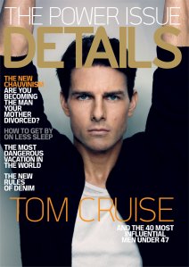
At the top of the cover we can see the Selling line which is usually a phrase advertising the magazine as the best, or the most unique. This is an unusual arrangement for a cover, as the masthead is normally at the top. Underneath the selling line, you can see the industry standard Masthead, in this case saying “DETAILS”. The Masthead is the typography that the magazine uses saying it’s name. Even though the selling line is large, and fairly bold, the Masthead is still larger and bolder. Underneath the Masthead you can see the Main Image, which is in this case Tom Cruise’ face. This space is clear of text, this is where the reader first looks on the cover. Underneath the main Image is the main cover info. This is the main feature of the magazine, in this case it is the 40 most influential men under 47. On the side of the cover, you can see the Cover lines, which are the other features in the magazine. Whoever designed the cover made certain parts of the cover info brighter than other pieces, drawing attention to them. This magazines target audience is Men between the ages of 25 and 47.
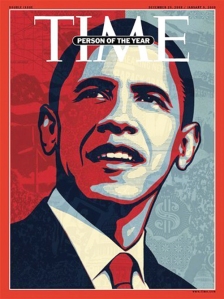
This cover is the total opposite of the first. It is minimalist, with no cover lines or selling lines. All focus is drawn to the Main Image, which is bold and simple, along with the Masthead and Main Cover line which is inside the Masthead rather than at the bottom of the page. The Main image is simple at a glance, but when you examine it closely you can see lots of different things in the background, making it more complicated. TIME magazine is iconic and read all across the globe which could be the reason why the cover doesn’t have a selling line. The target audience for this magazine is adults.
Unlike the other two covers, this magazine is aimed at the younger readers. Above the Masthead they have the Cover lines, along with the FREE POSTER advert, which younger people are interested in.


Leave a comment